Cronometer & UN Goals (UX Project)
For my first assignment at IADT my project partner Kevin and I were asked to create or redesign an app solving a problem aligning with one of the UN goals. We chose to redesign parts of Cronometer, a fitness and calorie tracking application for your phone.
Initially, I did research on how health and calorie tracking aligns to the UN goals. The 3rd goal is health with a sub goal of risk reduction in particularly developing countries.
Obesity hasmany associated health risks that could place stress on a developing country’s medical system. Counting calories and tracking food is shown to help understand nutrition better. This can help in a developing country without access to nutrition education. Additionally, Cronometer has an abundance of free features which makes it accessible to those who may not have resources for paid apps and subscriptions.
When we first met we were a bit confused about the scope of the project. But we got to work anyway and took a look at different apps. Some apps we discussed included Duolingo for educational goals, and Depop for sustainability. Kevin took a deeper dive into an app called Too Good to Go which I’m sure you can learn more about on his blog while I found Cronometer after realizing that the competitor, MyFitnessPal, was too locked down by a paywall. I didn’t want to pay because we knew our future personas would be in a developing country of less means. Also, I don’t want to spend money on a product when a more free version is available!
Doing my first heuristic evaluation was a bit confusing for me since I didn’t know what standard I should be holding it against. I have taken a few UX classes before and while I understood that some of the iconography was off, I didn’t understand that buttons should retain the same function even on different screens.
In my first heuristic evaluation my findings included:
- The discover tab had an icon of a chart, that didn’t match the wording “Discover”
- There were no automatically saving drafts of foods you had entered and exited before you saved them to your diary
- User manual is hidden in the more section
These issues will eventually direct my thinking toward the problem that we solve.
I then created my first proto persona for this project. Her name was Emily and she didn’t have a lot of depth to her. I also did user testing with Kevin and took note that the onboarding process was fairly standard but missing a few things like adding weight in ST or making a more simple password requirement. Otherwise most was smooth. He also noted that the “Discover” tab icon was a strange choice.
We decided to go with Cronometer as we felt it was aligned most with the project. Going more in depth on the research, I found that most other calorie and fitness tracking apps had similar steep learning curves. I created two more personas, this time going into more depth about who they are and aligning them with the UN goals.
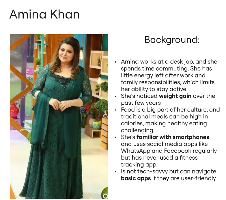
For the first persona I created Amina Khan. She is from Pakistan, a developing country, and works a desk job. This has caused her to gain weight which is why she wants to use Cronometer. She wants to lose this weight. With the persona I also created an empathy map. She feels frustrated she isn’t losing weight but wants to continue eating traditional foods that may be high in calories. Where the app can help her out would be counting her calories so that she can have smaller portions. This means she needs to be comfortable using the interface provided.
My second persona is Rajeesh Patel. Similarly to Amina, he lives a sedentary lifestyle and has gained a lot of weight. He is beginning to suffer from joint and other weight/lifestyle related health issues. However he is stubborn and easily frustrated with technology. Because of this, he will need a very simple application where he can focus on tasks like logging his food intake and exercise.
After creating the personas I went through the entire app, mapping out the flow and screenshotting every screen. Each step of the way I attempted to look at the application how my personas would. I made notes that helped me when I completed my second heuristic evaluation.
In my second heuristic evaluation I went more in depth about what I found on the application because I felt more comfortable with doing the evaluation. I noted down my findings:
- Settings selection doesn’t look like a button
- There are tabs within tabs
- The dashboard and the charts tab share the same data
- Lots of customization options but this may overwhelm new users
- Some buttons appeared in the same location but lead you to different screens (3 button option menu)
At this point I was beginning to see the problem but I wasn’t quite there. I didn’t yet have the language to communicate what I was seeing. This is where task analysis ended up helping me later in the project.
I went on to create a flow with Amina logging her breakfast. The biggest problem for her is that her local dishes aren’t added into the application and she has to add them herself. She doesn’t know how many calories are in foods and what macros are. This to me seemed like a missing opportunity for the application to educate users in nutrition. I created a journey map and noted how frustrated she got during this process which demotivated her to come back and use the app again.
Even though I had done all this work and I knew the application had problems, I was confused on what the scope of the project should be. We ended up talking to Stef, our professor and he helped look at what I was saying and point us in the right direction with the navigation problem. We decided to create another persona and evaluate the navigation system based on this new persona.
For my proto persona this time I did a lot of research as to what should be in it. I researched where in developing countries obesity is a big risk. This led me to thinking about how more elderly, less technologically savvy users would be confused in the navigation of Cronometer. From my research I concluded that a good place to have our persona be from is in Latin America, particularly Honduras. Some considerations would be making the application easy to navigate, accessible with little connection to the internet, and having most features be free. Since Cronometer already has a lot of free features, the problem we could solve best is the messy navigation.
My new persona’s name was Ana Morales. She wants to lose weight, learn about healthy eating, and avoid her genetic predisposition to diabetes. Ana shows the challenges and needs of a person living in a developing country like Honduras, where access to healthy food and healthcare may be limited, and financial constraints affect lifestyle changes. I created a scenario similar to Amina. Ana finds it time consuming to add in foods that aren’t in the App’s database, however if the application explained how, she would not be so demotivated by doing this.
One UX research method I found very helpful was task analysis and the Hierarchical Task-Analysis Diagram. At first I was confused about the difference between task analysis and flow but I read an article on NN that really helped. I created a task to check on your daily average potassium. Doing this really helped me key into the fact that the data was hard to find and relied a lot on recall rather than recognition.
To get to the section where you could find your daily average potassium you need to know to navigate to the discover tab and then to the report subtab and then scroll down.
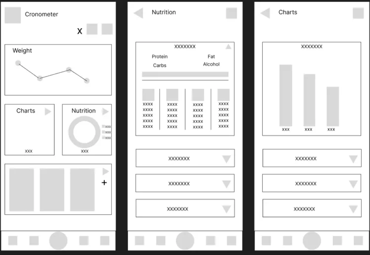
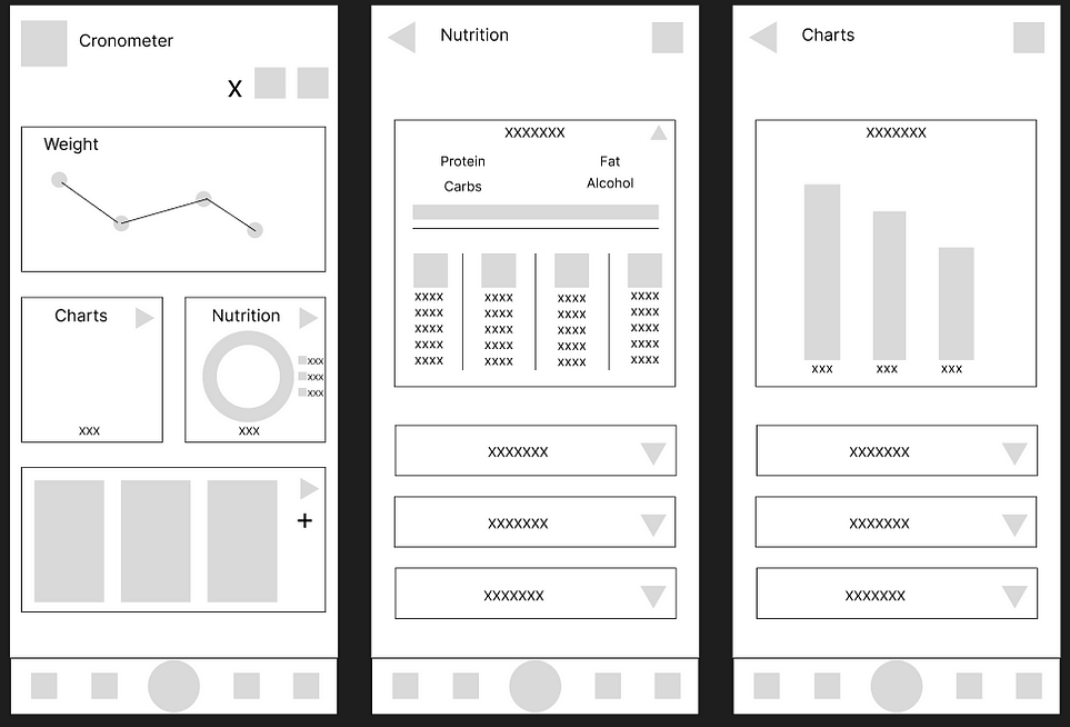
At this time, I knew what I wanted to solve was the messy discover tab with repeated information and confusing navigation. I began paper prototyping using ideas from my head. This wasn’t very scientific but it helped me get them onto paper so I could evaluate them using proper research.
From there I evaluated my designs against research to choose which design was the best and prototype out a full flow. From my research I found that creating a navigation hub was the best choice because the app is task focused. Plus, it also says that when options are hidden in sub menus and other non immediately visible locations, users will often forget about them. This is okay in browsing pattern applications but less so in quick habitual using apps like Cronometer.
I chose a design with large sections that can be expanded into a new page. This keeps everything on one page in the beginning so you can have a visual to see all the options you have. With this I expanded out the pages using figma to create a new design for all of the pages in the discover tab.
In the future I would have liked to do more iterations on the wireframes. I would have liked to do more user tests on the product with real users and surveys. I also would have liked to adhere to a UX framework more rigorously.
Having a user-centric approach was important for Cronometer to fit into the UN goals. After my research and problem solving I believe my designs help it to fit into the goal of health a little better.