AR Makeup App Wireframes
Task: Create an app where users can try on digital makeup and interact with new products they can purchase.
Software: Figma
This was a project I used to help familiarize with Figma, practice iconography, and typography. I asked Chat-GPT for a prompt and spent a week on this project. You can explore the final wireframes below. I wanted it to be a elevated a step above low fidelity but not high or medium fidelity. Placeholder photos are generated with stable diffusion.
Features
Slider Bar
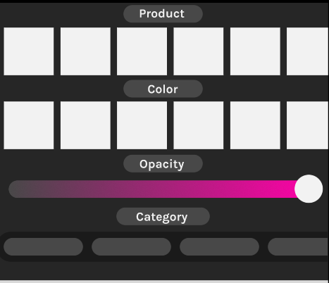 One thing I’m proud of is creating a working slider bar in the customization section for adjusting the augmented reality makeup. Using a component that enlarged the button on click and a component that used a mask to animate a slider, it functions as a slider bar. However it only can be at 0 or 100%. To figure this out I had help from a tutorial.
Navigation

The navigation bar takes you to 4 main pages on the app. Home, capture, community, and your profile. Each one will highlight when selected.
Buttons
 I made my buttons with a style guide in mind where hovering (pressing down without tapping) will change the color or highlight. I also created interactable checkmarks for the settings page. Here you can also see some of my iconography. I got my icons from iconify.
Process
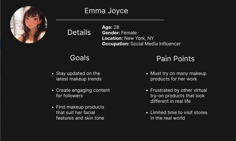
First I did some research and defined an avatar for a user
I also created a color palette and searched the Internet for some inspiration.

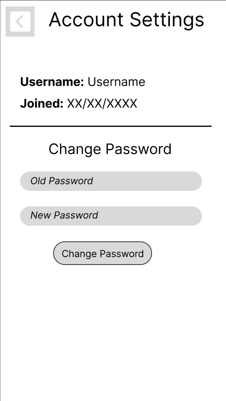
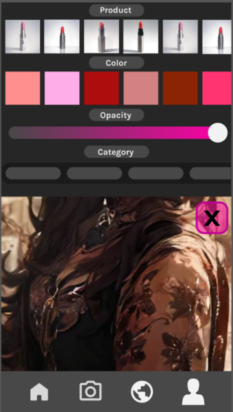
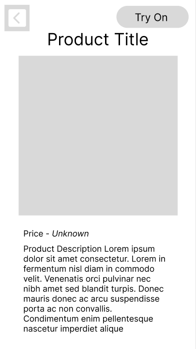
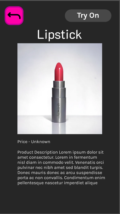
I then started out with a very low fidelity wireframe just to familiarize myself with Figma and get my thoughts onto a page. When creating the colored wire frames my goals were to create functioning buttons with variables, clean up design to look visually clear and appealing, and using some of the proposed colors while keeping it minimalist. Here are some before and afters.
Profile Page


Customize Makeup Screen

Product Page
Password Settings
