High Maintenance is a fast-paced mashup of classic arcade games with modern action gameplay.
Rather play the game than read about it? Play now instead
Taking inspiration from retro arcade games, High Maintenance is a third-person hack-and-slash adventure, with a gravity controlling super sword! Dive into the underground metro and show those rebellious janitorial bots who’s boss. Rack up points by smashing bots and stringing together killer combos. Want bragging rights? Check out how you stack up against other players on the online scoreboard—it’s like the ultimate showdown of janitorial justice!

Platform: Windows
Date: Spring 2023
Role: Product Owner, UI & UX artist and designer, Combat designer
Team Members: Andrea Kutsup, Joseph Romanowski,Nathan Desjardins, Noah Cichowlas, Noble Westbrook, Samuel Fox,Sam Sussman, and myself!

Contest: Ubisoft University Competition
School: Champlain College Montreal Campus
Theme: Arcade
Honors: Best User Experience winner. Additionally, nominated for Best Technical Challenge and Innovation and Best Creativity and Integration of the Theme
Working on the game
My team had 10 weeks to create a game meeting several criteria. There were 19 teams competing to win 9 different awards.
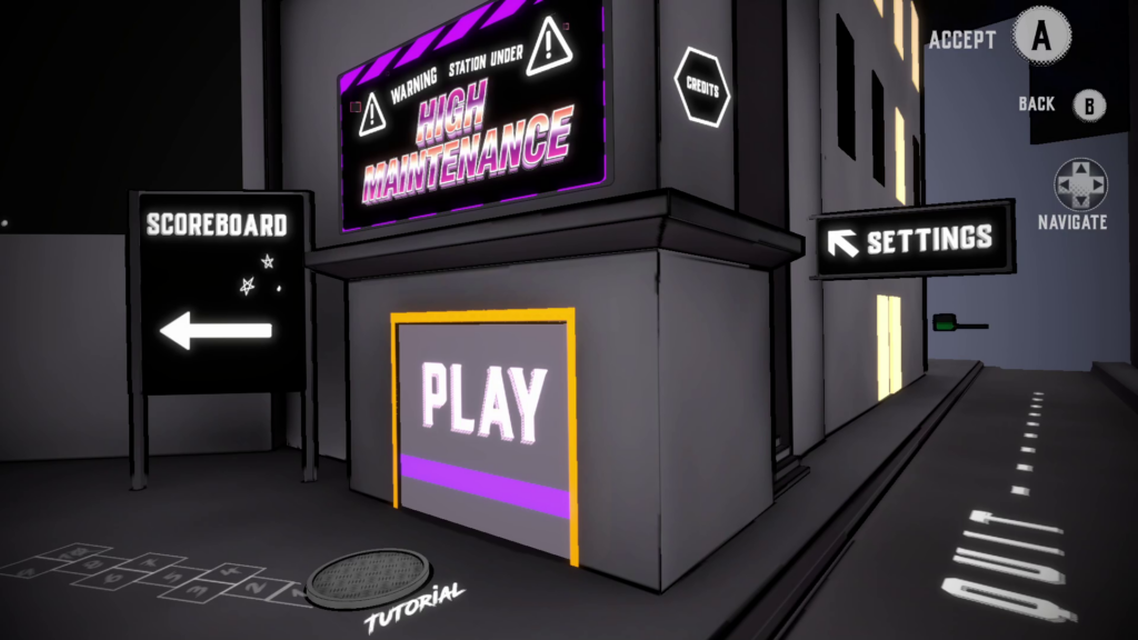
Contest Mandates
- Scoring and an online scoreboard
- Gravity manipulation
- Creation and destruction mechanics
- 2 pieces of concept art
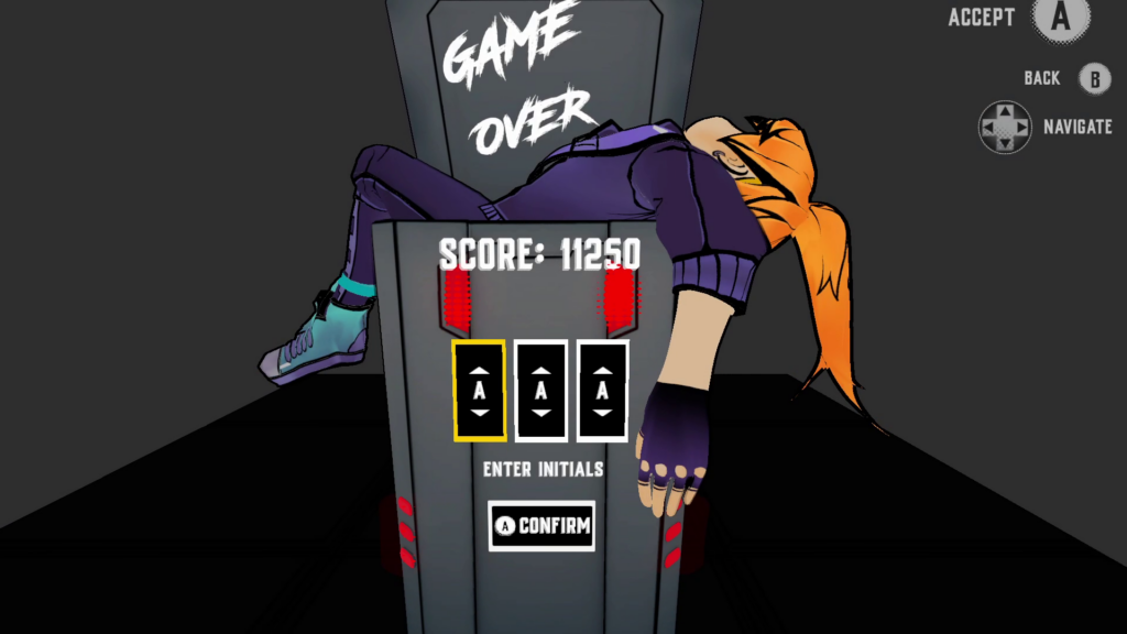
My Process (UI)
As a UX/UI designer for High Maintenance, I was tasked with creating a visually appealing and user-friendly 3D UI for the game. To show you my process, I will walk through the steps I took to create the settings section of the main menu.
I began by designing the preliminary concept art and functionality of the UI in Adobe Illustrator. This involved creating sketches and mockups of the UI’s layout and user interactions, and working with the development team to ensure that the design could be feasibly implemented within the game’s programming.
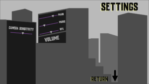
Once the concept art was approved by my team, I moved on to 3D modeling the city in Blender. This was an important part of ensuring that the UI elements would be properly placed and aligned within the game world and that the overall visual aesthetic of the UI would match the game’s metro theme.
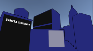
With the city model completed, I imported it into Unity and began adding the 3D UI elements. This could be rather painstaking having to ensure that the UI elements were properly positioned and scaled, and that they worked seamlessly with the game’s user input system. Several times I had to go back just to adjust small placement issues with the camera, transform position, or the way the features interacted with each other.
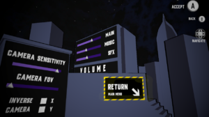
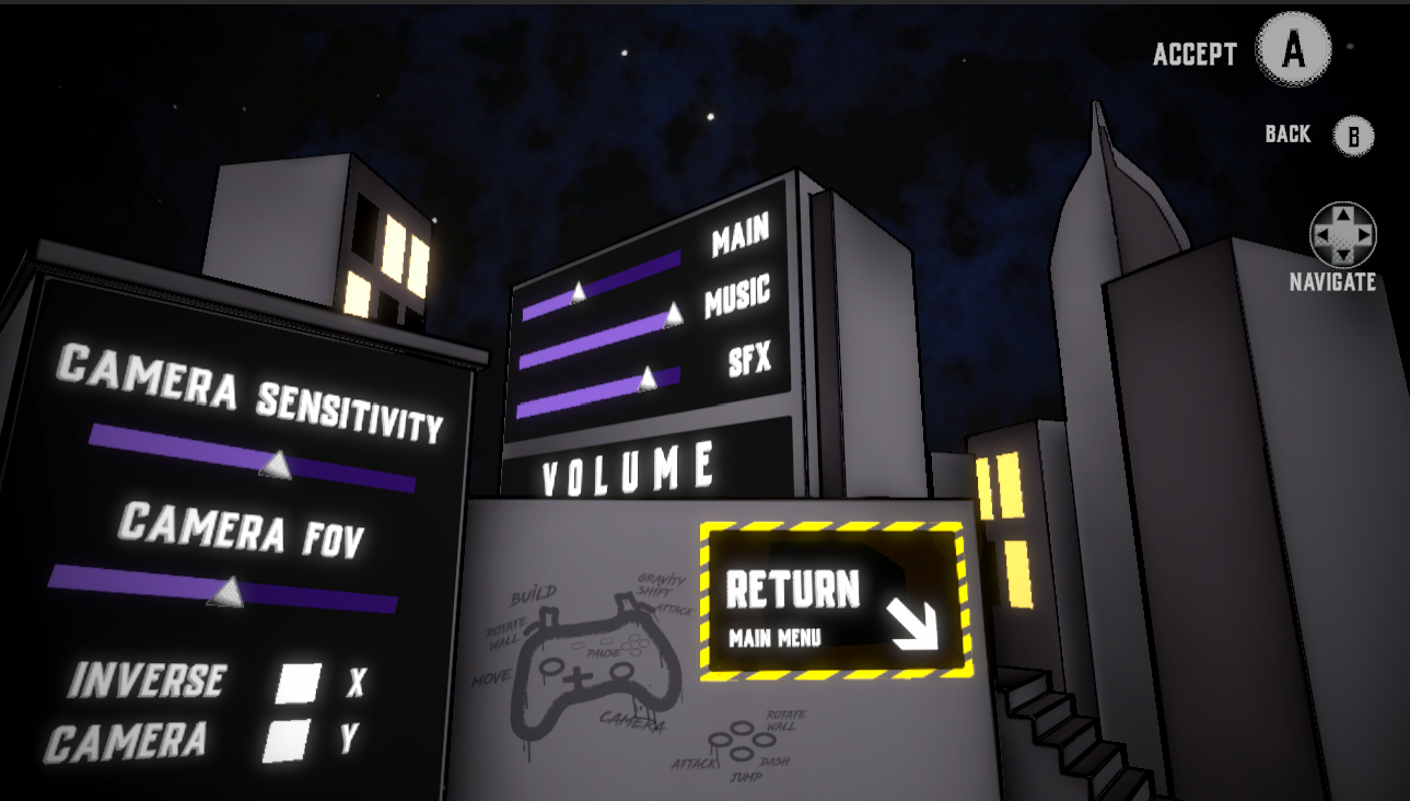
Through numerous iterations and constant refinement, I progressed toward the final textures and art of the menu. During the first pass, I added basic hand shading and outlines to give the UI elements flat shading to create a fake 2D look. This type of stylized art is used throughout our game’s textures. After reviewing the first pass with the artists and receiving feedback from QA, I then iterated on the design with a second texture pass that matched the rest of the game’s style.
I collaborated closely with my programmers to ensure that the UI functionality was properly implemented and that the design met the game’s requirements. By the end of the 10 week project, I had created a 3D UI that was both beautiful and user-friendly, and that matched the rest of the game’s visual direction.
My work on High Maintenance’s 3D UI involved a range of skills and contributions, from concept art and 3D modeling to texturing and collaboration with everyone on my team and testers. By following this process and bringing my multiple skills to the project, I was able to create a crucial element of the game that added to its overall visual appeal and usability.
More about the Contest
