Gear up your ship, customize your loadout, and fight for the fleet! Riptide is a spaceship combat game with an emphasis on powerful customizations and utility.
The release trailer showcasing the ship was created by our narrative and cinematic team.
Details
Platform: Windows
Date: Spring 2024
Role: UX lead
Released On Steam! Link
UX Lead
I ran UX meetings, maintained documents, and made critical choices about UX design in Riptide.
Team Members:
Flint Babineaux, Alissa Liu, Benjamin House-Kelly, Cat Davey, Daniel van Duzer, Gerrit Pottmeyer, Henry Foley, Jacob Davis, Lily McMurtrie, Merle Roji, Nicholas Kasprzak, Nicolas Delbue, Noah Cichowlas, Thomas Wagner, Zachary Navarro
Outfitting Screen
When I joined the Riptide team the outfitting screen was confusing, clunky, and visually unappealing. With the help of the technical designer and artists we made it easier for users based on QA research and UX theories.
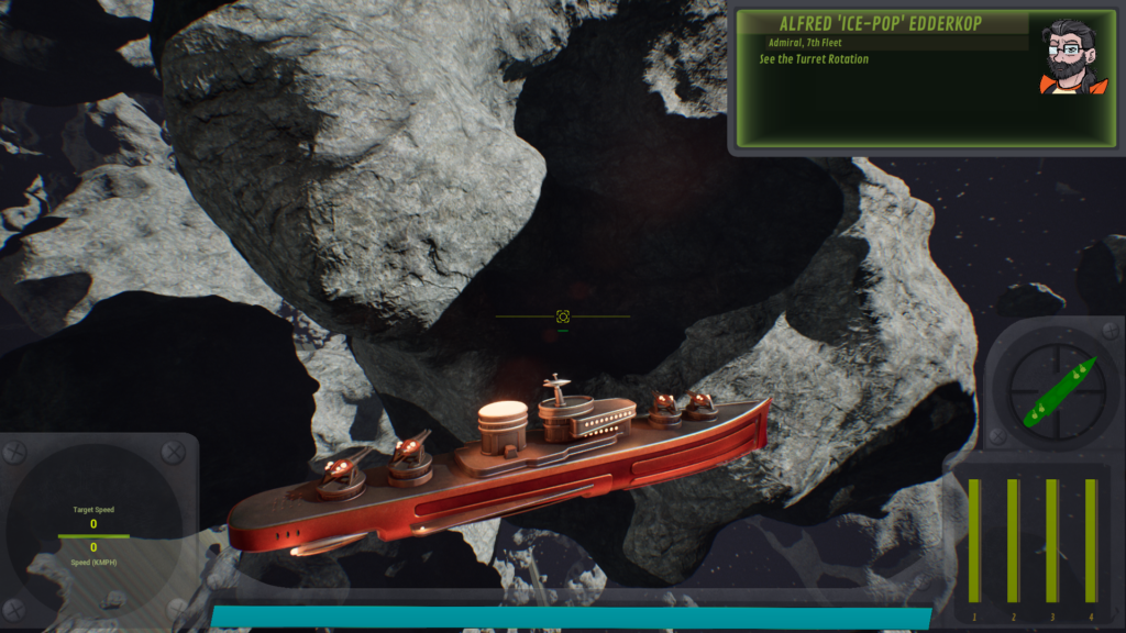
Outfitting Screen
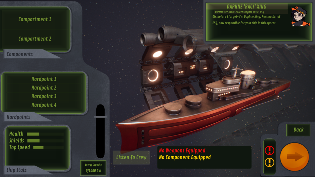
Iteration
The outfitting screen was where the player selects what guns and components they would be using. Here are early wireframes for the outfitting screen.
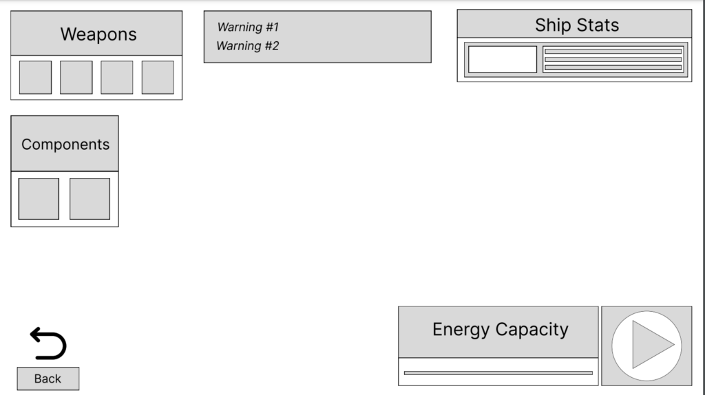
During the process of creating early medium fidelity drafts I tried to stick with the theme of using fantasy realism.
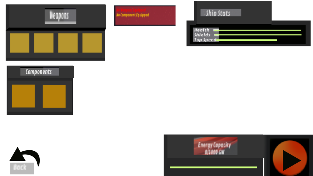
This design did not work out because the buttons are too square and there is no space for the narrative window. However I used pieces from other parts of the game to give it an early preview of what it might end up looking like. Here was my final draft before the artist was given the guide on creating the final pieces by our lead artist.
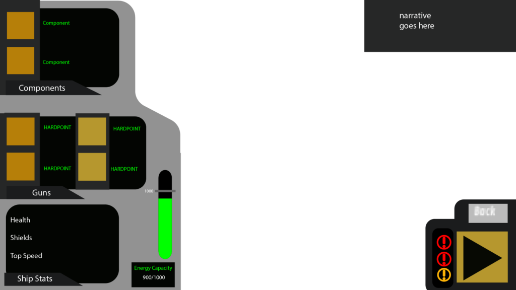
Early on a designer wanted to have the player confirm their choice of set up even after they had clicked on a new gun/component. My intuition was telling me that this would cause confusion in some players so we took our game to the user research testing lab and had players give feedback. Sure enough, the players stated that clicking back and forth between confirm and a new gun/component was getting in the way of their user flow. So we changed it to keep whatever component you had clicked on last without having to click a separate save button.
