Cozy Weather Application Design Personal Project
Prototype below (May take moment to load)
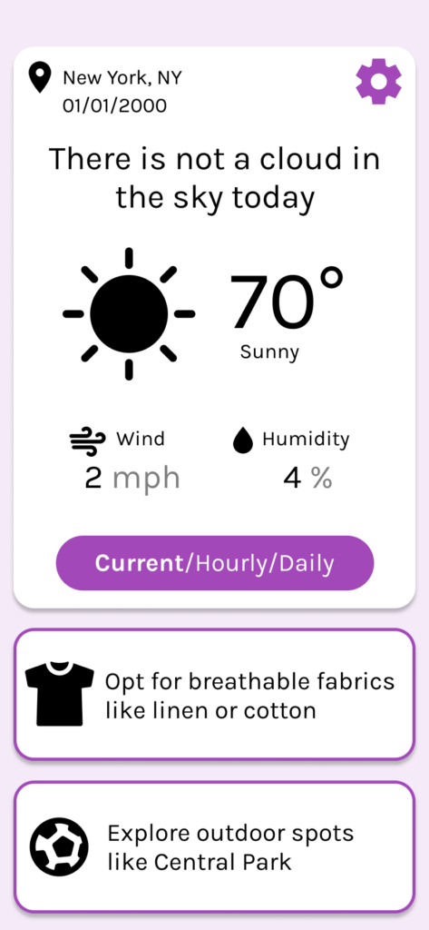
Multiple phase personal project to design a weather app with a cozy feel and light kawaii elements. I also wanted to incorporate a new technology so I thought an interesting feature would be AI suggestions for fashion and activities.
Planning Phase
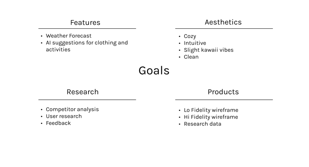
I started by defining the project goals
Research
Competitor Analysis
Accuweather
Overall, I see why this is a popular application but it does not fit the goals I have come up with for my project and will likely not suit my target audience.
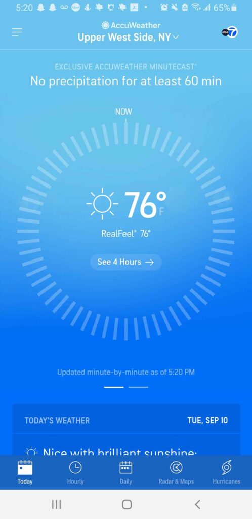
Strengths
- Large central temperature
- Summary at the top with a warning
- Easily navigate to other panels with the navbar
Weaknesses
- Blue light makes it hard to sleep
- Many proprietary phrases that can confuse users (RealFeel)
- Over-designed and may overwhelm some users especially with their use of ads
- White on light blue can be hard to read for the visually impaired
WeatherBug
Overall, I like this WeatherBug better than Accuweather due to it being more user centric and convenient. However, I still think it has too many features and can overwhelm the user base I am trying to cater to.
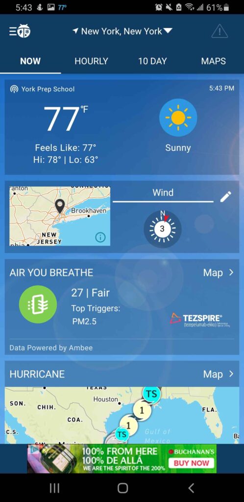
Strengths
- Text is easy to read
- Adds a notification to your phone with the temperature which is neat
- Important information is at the top (temperature)
Weaknesses
- Blue background
- Too many features on the front page may overwhelm users
Kawaii Cute Weather Forecast
This app is still in development so I don’t know how much more they plan on adding but I really like the simplicity of the current design with the fact that you can see the hourly and daily forecasts on one main screen. The font poses a big problem to accessibility.

Strengths
- Can see current temperature, hourly, and weekly on one page
- Cute designs
- Good iconography for reconfiguring the location
- Pastel color background
Weaknesses
- Font is hard to read
- Less features than some of the other apps
None of the 3 applications I have found have all the key features I am looking to create in my application. Only one fits the cozy requirement and none of them are using AI suggestions as a feature.
User Research
For the preliminary user research I combined a survey with direct interviewing.
Interview Results
In my direct interview I asked what made an app “cozy.” Here are the responses:
“part of it I think comes from a simple layout, something that’s not overtly complex”
“using colors that are easier on the eyes, that’s part of the cozy feel”
Survey Results
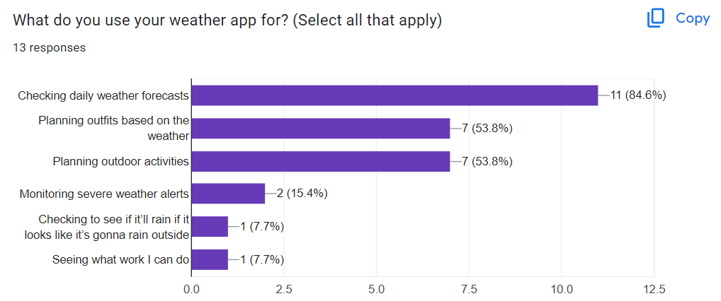
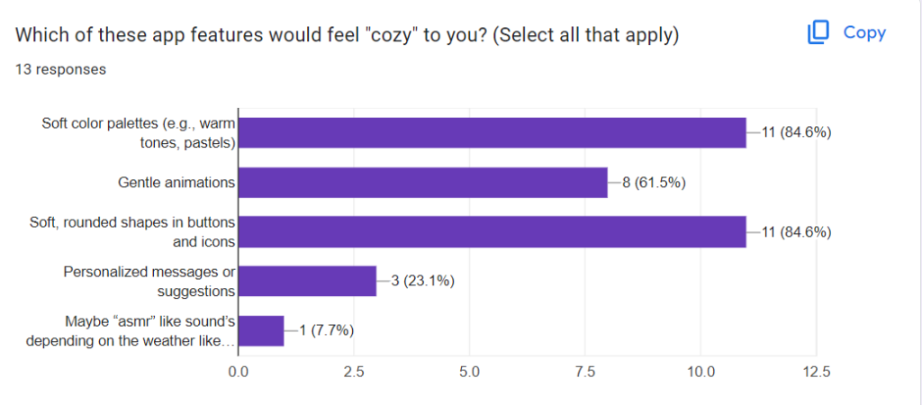
I asked 12 questions focusing on current app usage, cozy themes, and features that are important to the user.
This question focuses on usage of current weather applications. While most everyone wants to check the daily forecast, many also use it to plan outfits and activities. This show that I have a lot of interest in what my product could deliver and that I should put these features in important locations.
In an open-ended question I asked “What would make a weather app feel cozy, welcoming, and enjoyable for you to use?” A couple responses stuck out to me:

Approachable language is really interesting because I think having a welcoming message is important to the cozy aesthetic of my application. Aesthetics can include more than just visual design. I also wanted to focus on easy, non distracting navigation.
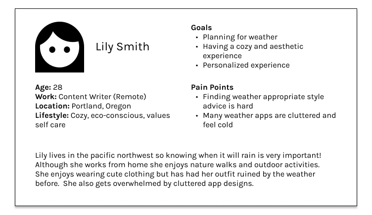
User Persona
Additional Research
According to MOVR research the iPhone 11 is the most popular smartphone in the world so I will be designing primarily for that screen size.
Ideation and Early Design
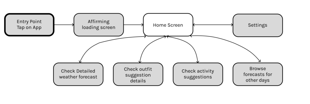
Simple User Flow
Simple user flows are good to show outside parties the basic plans and help designers plan out what they will be designing. If you add many details the flows become hard to parse.
Feature List
Weather
- Current Weather
- Location
- Date, Time
- Temperature and state of skies with icon
- Hourly Forecast
- Daily Forecast (for the week)
AI
- Affirming weather message
- Outfit suggestions with AI
- Activity suggestions with AI
Settings
- Add information for the AI to use in outfit and activity suggestions
- Color palette options with accessibility
Home Screen Wireframes
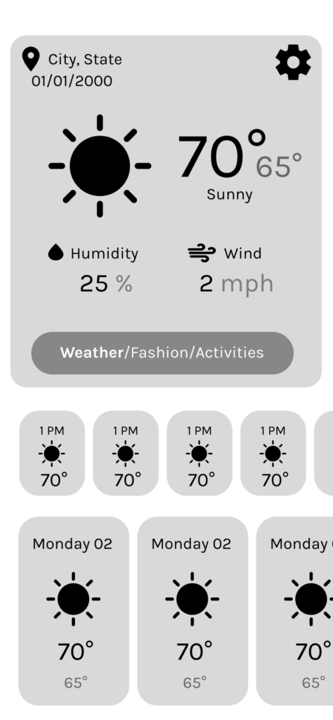
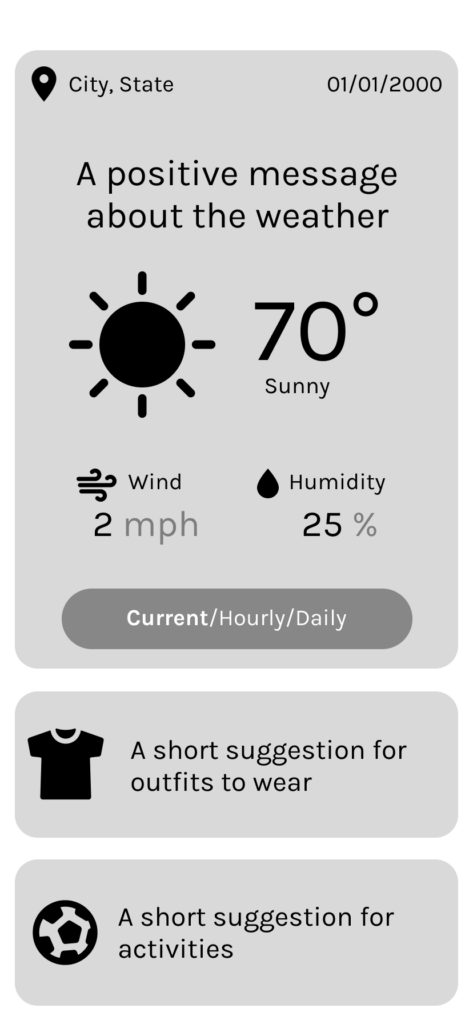
Click through the 3 possible designs I created with limited interactivity and detail.
Pros and Cons
I reviewed my 3 concepts and asked several potential users which design they liked best and summarized feedback and thoughts into a pro and con list for each concept.
Concept #1
Pros
- Can view current weather simultaneously with hourly and daily forecasts
- Features current weather in large text
Cons
- One of the main features, AI advice, is not displayed on the home screen and you must click to view it
Concept #2

Pros
- Has weekly forecast on the main screen
- Room for a pretty picture in the main box
- Has the “feels like” temperature statistic
Cons
- Confusing navigation to AI features
- Not immediately apparent that you should scroll
- Settings is in the left when you usually find it on the right
Concept #3
Pros
- Clean design
- Focused on the main features of the application
- Clear navigation
Cons
- I forgot to add a settings icon for settings navigation
- Does not feature the hourly and daily forecast on the main page
Wireframes
I chose to use concept 3 as the home screen because I felt it emphasized the important features and made it clear to the user the important weather data. It also looked visually clean. I did not use time data because most devices have the time at the top of the screen.
Home Page

Current Display
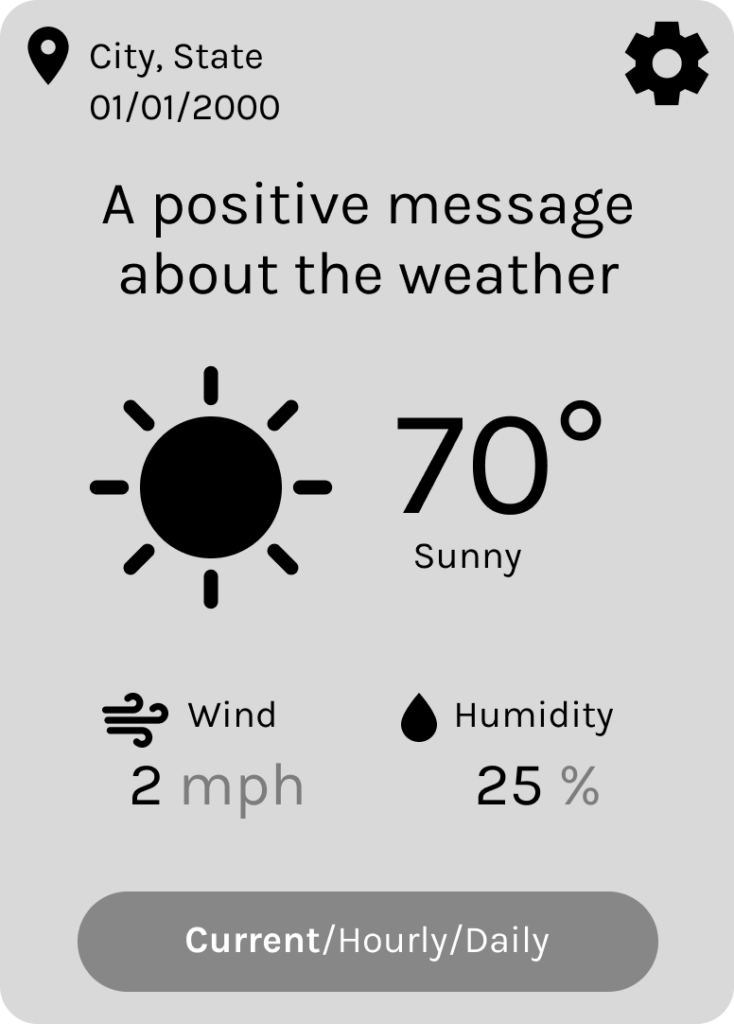
I created this frame as a component so that I could easily prototype out the interaction between changing it on the main screen.
Hourly Display
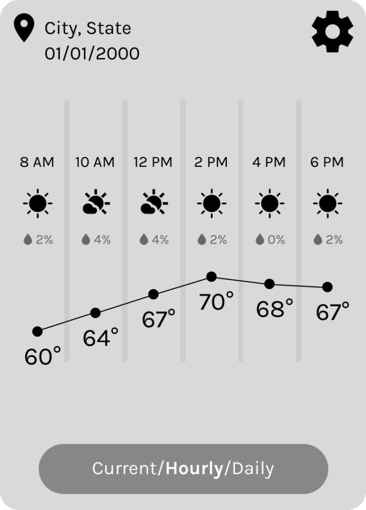
The graph gives the user more visual information to parse at a glance.
Daily Display
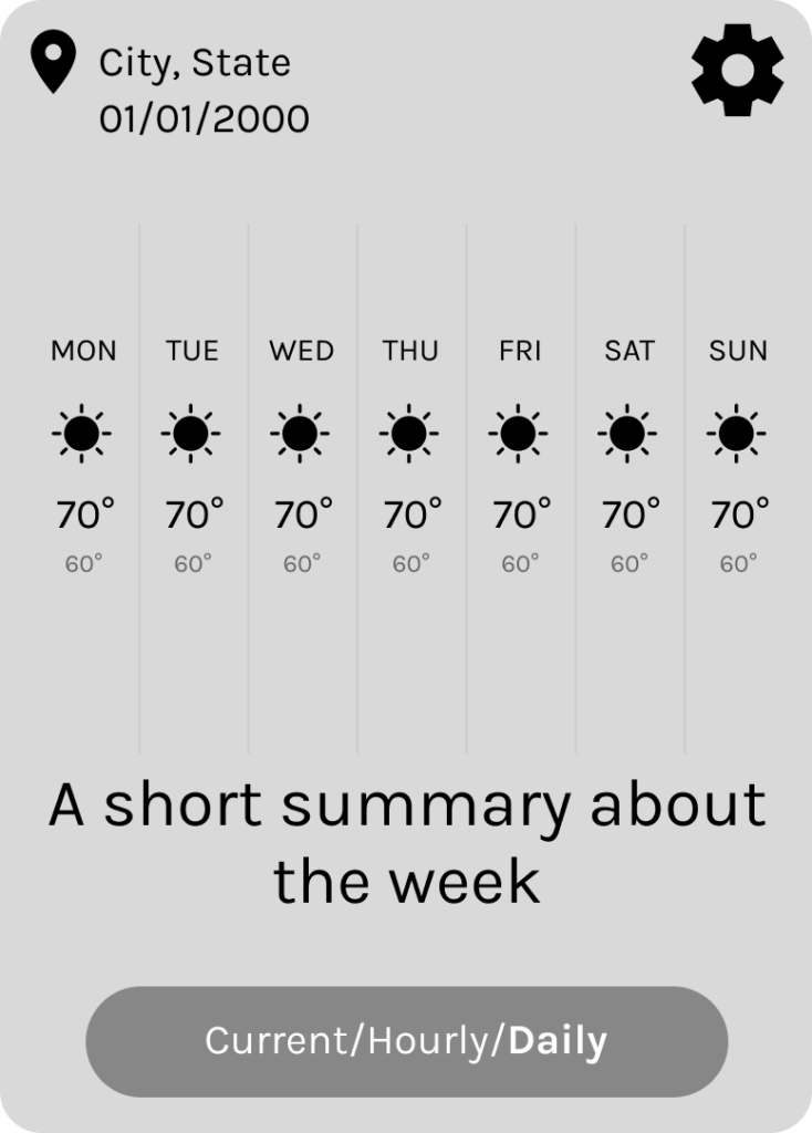
Clothing Suggestions Page
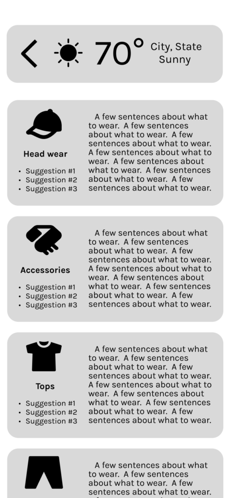
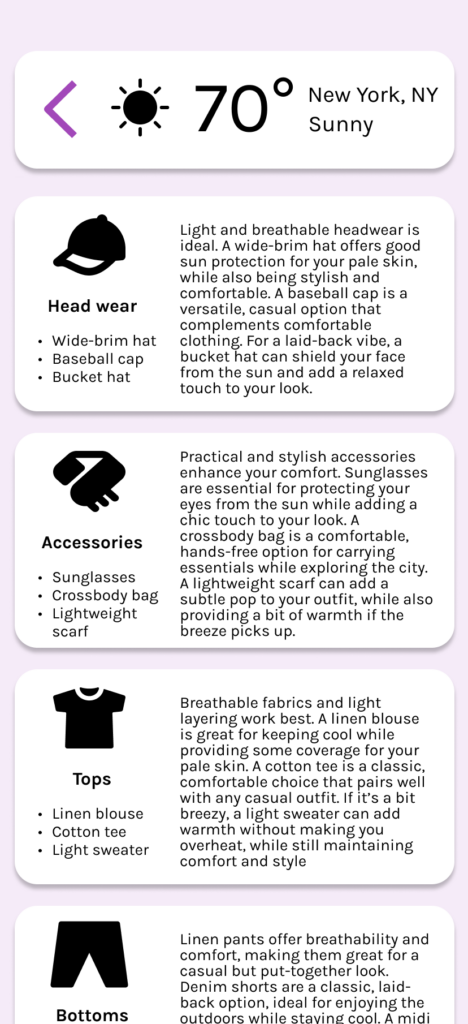
In the suggestions page you can swipe right to go back to the main page as well as tapping the back icon in the top. You can also scroll down to see the footwear category. These suggestions take into account what you add into the settings page.
Activities Suggestions Page

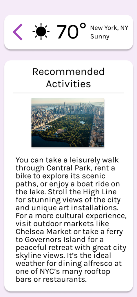
Since events aren’t easily categorized I decided to go with bigger font and only one section. I also added room for an image. This could be added daily by those managing the app or selected/generated by AI to match the activity suggestion. The AI would be given the location, current weather, daily forecast, information set in the settings page, and be given the prompt asking for activity suggestions.
Settings
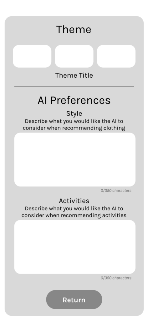
On the settings page I kept things clean with the options for different color themes at the top and multiple entry forms for adjusting how the AI suggestions are given. You save your changes and return with the return button at the bottom. I put a character limit on it so that users cannot mess up the AI too much if using in bad faith.
At this point I want to start thinking about how I would do prompt engineering for the AI. I start by considering all the data points that are relevant and the question I want to ask.
Data Points for clothing suggestions
- Date and time of year
- This is important to know in terms of if there may be certain events or nature related changes to the ground like fallen leaves or humidity.
- Current weather data and forecast for the day
- This is obviously important because temperature and rainfall definitely dictate what you can and can’t wear.
- Location
- This dictates what setting you are in, if there are certain items you can and can’t wear culturally. It also is more information about accuracy of the forecast and historical rainfall patterns.
- User input
- Anything the user has directly told the application. This could be about style preferences, material intolerances, or whatever they think is important.
The activities data points are much the same.
High Fidelity
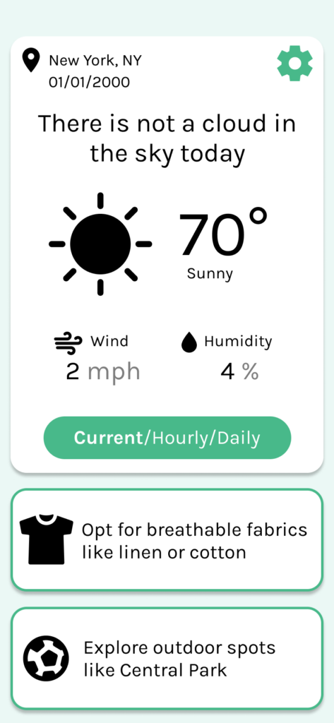
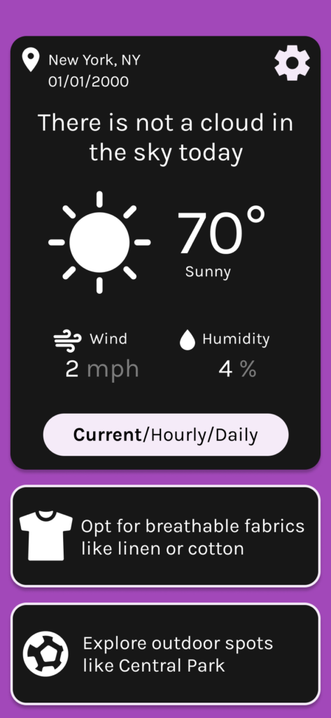
I ended up using 3 high contrast color palettes for accessible themes that can be swapped in the settings panel. I used a specific color for anything that is interactable. My wish would be that I could integrate full usability in this prototype that allows sections to expand based on the amount of text given by the AI powered suggestions. To use the full prototype return to the top of this page.


Themes
